However, considering this, these creative CV's should be sharp and proffesional whether they are eye catching or not. They should promote your style well and although presentation is important this doesn't necessarily mean it has to be really unusual either.
In order to make my own 'creative' CV I am first researching some existing examples and anaylsing them so I know what works and what really doesn't in regards to this.
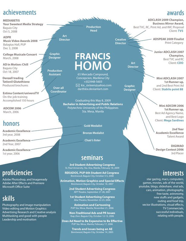
I did not think this was a great creative CV. If I was an employer and was handed this, well, first of all I would be confused as to where to start. There is way too much information and text crammed into too small a space. The idea was good but the execution could have been a lot better.

I liked this CV because the information is laid out in a concise, clear way in a good type and the colour scheme isn't too loud. I'm not too keen on the crumpled paper effect but the little arrows and icons add a nice touch and I especially like the main heading of the page. It's very graphically designed but I think it works well and I would enjoy reading a CV like this.
In theory this a good design for a CV.
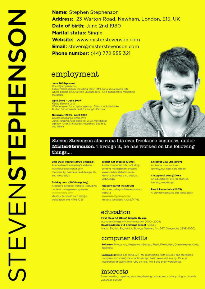
I like the general layout of the CV, especially the black dividing box and the photo he has provided of himself. The information, although not laid out in a traditional CV style, is well presented in a good typeface and I like the font he has used for headings.
The only qualm I have with this CV is the background colour; the bright yellow is a little too bright for my taste (you want to impress employers, not blind them!)
No comments:
Post a Comment